OnlineMedEd
·
Lead ux/ui Product Designer
·
Jun 2018 - Aug 2022
Flashcards for OnlineMedEd
A mobile-first rebuild for iPhone and iPad

01
Overview
OnlineMedEd (OME) helps over 350,000 medical students prepare for board exams every month. Their curriculum runs on a peer-reviewed methodology called PACE, where video lessons, notes, question banks, and flashcards reinforce each other on a set schedule.

Their existing all-in-one mobile app tried to deliver every content type in one package. It crashed on iPad, buried non-video content, and made it hard to find specific decks. Rather than patch it, we stripped the app back to a single job: flashcards. That decision freed us to solve for repetition, discoverability, and iPad scaling without dragging along the rest of the platform's technical debt.
I led UX/UI on the ground-up rebuild, with a focus on iPad scalability, spaced repetition, and a smarter content taxonomy for search and filtering.
The Team
3 Developers
Product Owner
UX/UI Designer (Me)
My Role
Lead UX/UI Designer
Consulted on backend architecture with the engineering team
Deliverables
User flows and information architecture
Wireframes and clickable prototypes
High-fidelity designs
UX documentation and content taxonomy
App Store assets
02
Challenges & Constraints
Most repetitive learning apps rely on user-uploaded content, which often contains outdated or incomplete medical information. We wanted to offer flashcards that felt as familiar as students' favorite apps, but paired with peer-reviewed content and a structured lesson curriculum.
We also inherited a set of legacy constraints that had frustrated users on prior iterations:
The legacy app was hard to use on iPad, where nearly 30% of OME's users studied, and it crashed frequently during use.
Flashcards only unlock 48 hours after a lesson video is watched. Users had no clear way to know when new decks were on the way or when they were ready to review.
Free and Premium users needed meaningfully different experiences without gating the free tier so aggressively that it lost its value.
Finding a specific flashcard set was slow, since the existing content structure didn't match how students actually searched.
Solutions and Goals
Rebuild the mobile app from the ground up, focused entirely on flashcards, to reduce support load on other content types.
Design a notification system that communicates the 48-hour unlock window and surfaces newly available decks.
Scale content and layout to work equally well on phone and iPad.
Deliver a clear Free vs Premium experience with well-timed upgrade moments.
03
Strategy & Research
We audited the flashcard and e-learning space to find our differentiation. The goal was to stay in line with OME's established curriculum while delivering real value for both Premium and Free users.

Anki was the most popular option among med students. It offered hundreds of medical decks and was fully customizable, but the UI was hard to navigate, decks had to be manually created, and the app wasn't focused on med school content specifically. The content was not peer-reviewed.
Quizlet had strong organization tools, image and audio support, and suggested decks, but its content was largely user-submitted and angled for high school and junior learning. Ads cluttered the free version, and multiple focus states made the experience feel confusing.
Key Insights
Spaced repetition was a preferred feature for students and aligned naturally with how the PACE curriculum was already shaped.
Simplicity was the wedge. Most competitor apps buried content behind cluttered UI and unclear hierarchy.
Users wanted to find and jump into specific content quickly. Navigation needed to be concise and to the point.

04
Design Approach
UX and flows
The timeline was tight, so I started by mapping flows for the full app before jumping into screens. That included in-app subscription upgrades, error states, and onboarding. Low-fidelity prototypes were the venue for arguing product logic with engineering before pixels were on the table. I also collaborated with engineering on a backend approach that could support the intended experience.

Content taxonomy
Search was a robust part of the application, and we had a lot of user feedback about how difficult it was to differentiate learning tracks and find the right topics. I put together a content taxonomy to define how search could work and to align internal and external teams on shared language:
This unblocked search, filter, and future integrations across the platform.

Navigation
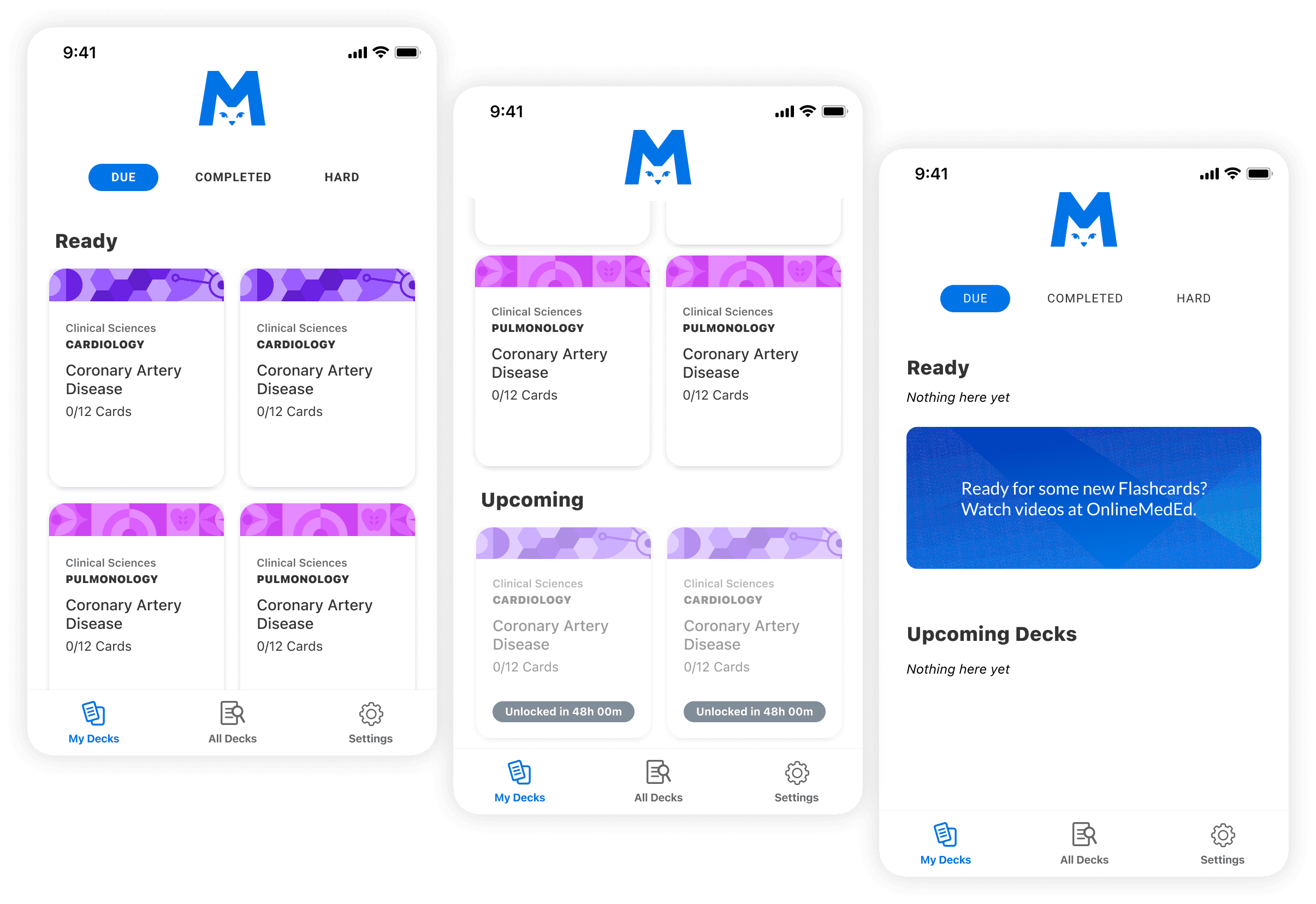
In previous iterations, users struggled to find specific flashcards. I broke the dashboard into three sections built around jobs to do:
My Decks for available flashcards
All Decks for search and filter
Settings for account and app preferences

Content scaling
iPad users made up roughly 30% of OME's mobile audience, so I designed mobile-first and then scaled up with breakpoints tuned for larger screens. Diagrams, histology images, and answer inputs all needed to hold their weight on both form factors.


Answer comparison
Premium users get the ability to type a response and compare it to the peer-reviewed answer. That supports active recall rather than passive review. Free users see this feature during onboarding as a preview of what Premium unlocks.

Free vs Premium
Free users get a taste of Premium with clear, well-timed upgrade moments (48-hour countdowns, deck previews, upgrade banners at natural decision points). Premium users get unlimited access, media-rich cards, no wait times, repetition settings, and a confidence rating that shapes future repetition scheduling.

Onboarding and unlock communication
I designed a Getting Started walkthrough and a persistent Upcoming section on the dashboard so users always knew what decks were coming and when. That addressed one of the biggest sources of confusion and support tickets from the legacy app.

05
Outcomes
The design deliverable focused on UI designs, UX documentation, and content taxonomy, with the goal of a soft-launch to beta users. Beta launch was deferred due to conflicting product initiatives, so the app itself didn't reach user testing. The core architecture, high-fidelity designs, and documentation were fully packaged and handed off to a third-party agency for implementation.
The biggest win reached beyond the flashcard app itself.
The content taxonomy I developed was adopted and expanded by the broader Product and Engineering teams and rolled into the platform's overall content structure as a foundation. It gave the org concise language for what role each piece of content played inside the curriculum, and it became a shared vocabulary across teams that had previously been misaligned.
06
Lessons Learned
Sometimes the best UX move is subtraction.
The legacy app was trying to do everything, and it showed. Reducing scope to a single job freed us from years of technical debt and sharpened every design decision that followed.
Content taxonomy is a design deliverable.
A shared vocabulary between design, engineering, and marketing removed weeks of confusion downstream and enabled search and filtering to work the way users expected.
Not every project ships, and that is okay.
Documenting the why behind each decision is what carried this work forward to the next team. The core system was strong enough to hand off with confidence.