Onlinemeded
·
Lead Product Designer
·
Jul 2019 - May 2020

My Role
Lead Product Designer
Team
4 Engineers, 1 QA, 1 PM
Timeline
July 2019 - May 2020
Focus
UX strategy, research, info architecture, interface design
OnlineMedEd had built a comprehensive curriculum. Students weren't using it like one.

OnlineMedEd helps medical and PA students prepare for coursework, clinical rotations, and licensing exams.
The product had expanded beyond its popular video lessons into PACE, a premium curriculum combining videos, notes, question banks, and flashcards. But students continued to rely heavily on video, with only 18% completing the broader curriculum associated with their lessons.
As Lead Product Designer, I worked across Product, Engineering, Data, and Content to understand why, and to redesign how students planned and moved through their coursework.
We thought students couldn't find the content. The real problem was deciding what to do next.
The initial assumption was that students weren't engaging with notes, questions, and flashcards because those resources were hard to discover. Better navigation seemed like the obvious solution.
But medical students were already balancing coursework, clinical rotations, exams, and limited study time. Research showed they could find the content; they struggled to decide what deserved their attention next.
That reframed the project from improving discovery to turning the curriculum into a prioritized daily plan.
Behavioral evidence shifted the problem from discovery to prioritization.
Four baseline numbers framed the opportunity. OnlineMedEd reported that more than 86% of US medical students used the platform, and 89% studied across multiple tools in their routine, so cross-modality behavior was not foreign to the audience, it just was not happening here. Only 18% of users completed the full PACE curriculum for their lessons, and only 8% of institutions used the platform for structured lesson plans. The audience was there and the behavior existed elsewhere; the structural connection was missing.
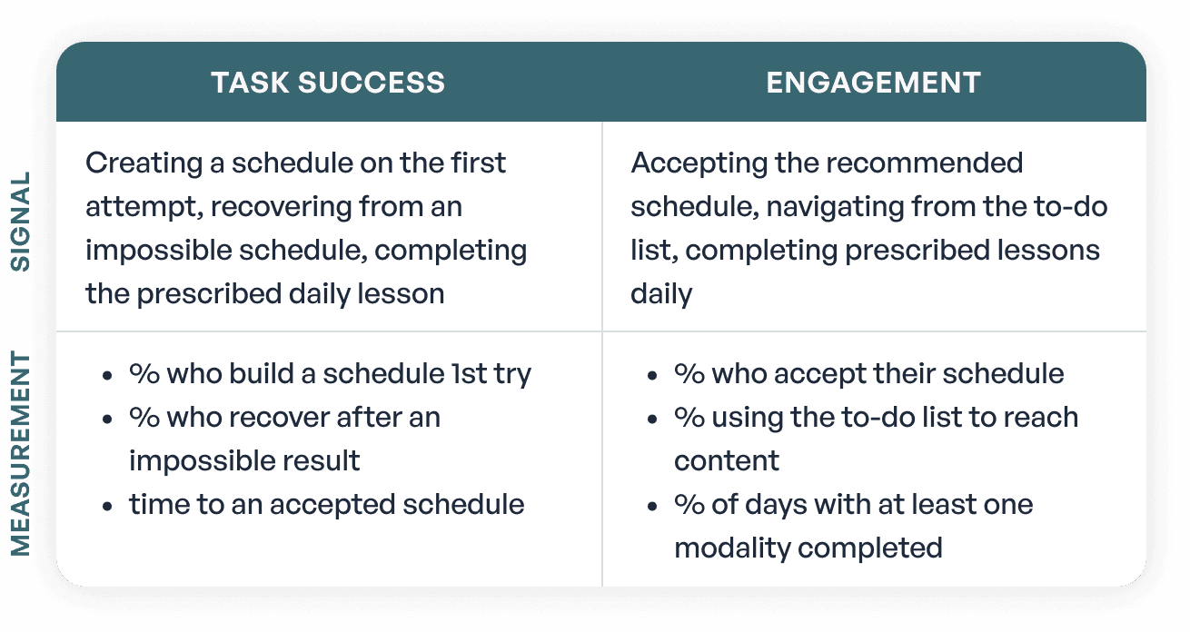
We mapped all five HEART dimensions, using Engagement and Task Success as the primary signals of success and the basis for measuring engagement.
I partnered with Data to analyze behavior across roughly 200,000 active accounts, reviewed session recordings to understand how students navigated between content types, and helped structure research with student beta cohorts around how they planned their study time. Together, the research showed that the product's architecture was asking students to assemble their own learning workflow.
Three findings shaped the decisions that followed.
INSIGHT
Students needed a next action, not another dashboard. The existing dashboard summarized completed activity.
They cared far more about what to accomplish today and whether they were on track for their exam.
01
Make the Scheduler the product's primary surface.


The v1 dashboard looked backward, summarizing activity students had already completed. Research showed students were opening the product to answer a different question: what should I study today?
Rather than adding scheduling as another dashboard feature, I made the Scheduler the dashboard itself. Students entered their exam, test date, available study time, and target score, and the system generated a recommended plan that prioritized lessons against their timeline. Weekly and monthly views gave visibility into the larger plan while keeping today's work at the center.

The product shifted from showing students what they had done to helping them decide what to do next.
INSIGHT
Students studied by lesson, not by content type.
The product separated videos, notes, questions, and flashcards into different destinations, but students moved between those resources around a single topic. The information architecture didn't match their mental model.
02
Organize the curriculum around learning, not content type.
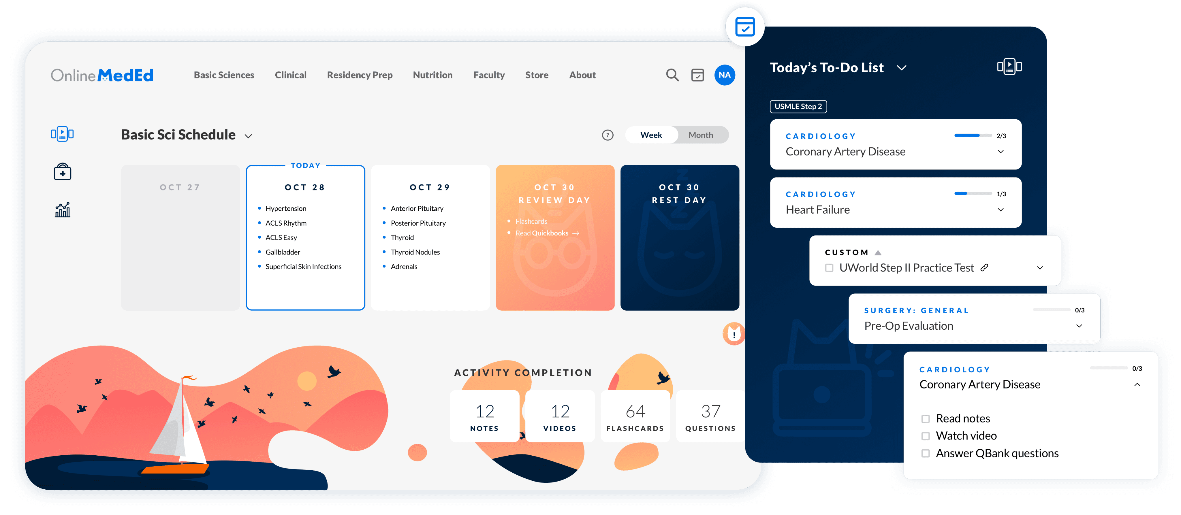
I restructured scheduled lessons around the lesson as the unit of work. Each lesson brought its related video, notes, questions, and flashcards together inside the study plan, so students could move through the full curriculum without navigating between product areas. Instead of asking students to discover additional content, the system brought the right content into their workflow automatically.
INSIGHT
Students thought in today's tasks, not in calendars.
Beta testing showed students thought less about "their schedule" than about what they still needed to finish today. A calendar solved planning, but not execution.
03
Make the next action available everywhere.
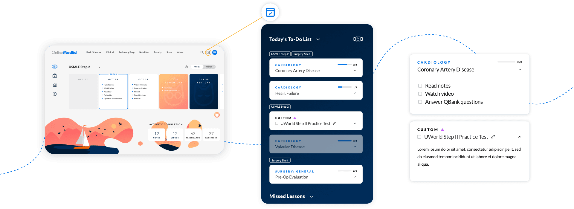
I designed the to-do list as a portable component separate from the Scheduler itself: the Scheduler managed the larger plan while the to-do surfaced immediate actions wherever students were working. That separation held as the product grew, letting the task system support additional content and communication without a new interaction model.

Across beta versions, students asked for granular control over their plans.
The final release delivered on those asks. Students could drag lessons between days, block off days, add SHELF exam support, filter completed material, and adjust their plan freely. Most still followed the recommended plan. The customization earned trust; the defaults created momentum.


I worked embedded in the engineering pod, not adjacent to it.
The Scheduler's prioritization logic, content model, and interface were too interdependent to design in a separate phase and hand off. So I worked inside the build. I was embedded in a pod of four engineers, a QA engineer, and one to two PMs, and I was in the standups, the retros, and the iteration cycles alongside them from discovery through release.
That closeness changed what design could do. When engineering hit an implementation constraint, I was in the room, sometimes in pair-programming sessions, to work through alternative approaches before the constraint forced a compromise in the experience. Override patterns, recovery flows, and edge cases got designed into the system early, through event-storming and continuous iteration, rather than patched in after they became technical debt.
Data defined success. I partnered with Data to establish a HEART framework around Engagement and Task Success, and to measure whether the new model changed student behavior.
Content architecture became a product dependency. Bundling modalities around a lesson required coordinating with Content on tagging and curriculum structure, so content architecture evolved in sync with the interface rather than separately from it.
Changing the organizing model changed how students used the product.
30 to 40% increase in non-video engagement.
Measured through the Engagement and Task Success signals we tracked from launch, students engaged substantially more with notes, questions, and flashcards once those modalities became part of their study workflow.
~18 to 20% increase in premium conversion.
Greater engagement with the broader PACE curriculum contributed to stronger premium conversion.
4.1 / 5 beta satisfaction.
More than 130 beta participants reported feeling more organized around rotations and exam timelines.
Institutional interest.
The Scheduler drew early interest from educational institutions in structured, syllabus-aligned deployment.
OnlineMedEd was later acquired by Archer Review.
What I owned
As Lead Product Designer, I owned product and UX strategy, research synthesis, information architecture, interaction and interface design, onboarding, and the portable to-do system.
Across my four years at OnlineMedEd, I also owned the design system and illustration library that supported the platform, much of which remains in production today.
What I didn’t own
I partnered with Product on scheduling logic, Data on behavioral analysis and measurement, Content on curriculum structure, and Engineering on system behavior and implementation. The scheduling algorithm, curriculum content, engineering implementation, and analytics infrastructure were owned by their respective teams.
Abundance isn't always a value proposition.
What looked like a discovery problem was a prioritization problem. Students didn't need more ways to browse; they needed direction.
Architectural decisions are interface decisions.
Bundling modalities, separating the task system, and making the Scheduler the primary surface were system decisions the interface made visible. The senior work was mostly upstream.
Strong defaults need a trustworthy escape hatch.
Students usually followed the recommended plan, but full control gave them the flexibility to make it their own, and the trust to rely on the default.